Part 1, part 2, part 3, part 4, and part 5 can be found here. Ready to learn how support, confidence, and lift work in a market basket analysis? Alright. Let’s go.
Let’s think of our Market Basket Analysis like an old school factory machine. Before the machine, on the conveyor belt, is our data. Coming out of the other side are the desired insights. On this machine, with red squiggly knobs, are three levers we can pull. Three controls we can use to shape things.
(Actually, there are two. Because one of them is set to off—as it’s the one we’re after. But more on that later.)
The weaker these levers or settings are, the more rules or insights we’ll get out. But…the less we can trust them.
The stronger these settings, the fewer insights come out. But the more we can trust—you get the idea.
These also affect how long the machine runs. The weaker the settings, the longer our machine will take to compute our data.
These levers, or parameters if we’re going to get mathematical, are:
Support: This is the probability of any of the variables or items occurring in our dataset. To extend our previous example, it would be the number of customers who prefer pink, out of a total of all our customers.
Confidence: This is a measure of conditional probability. Given that we have customers who prefer pink, how likely is it that they also have X condition? To keep it simple: This could be given that we have customers who prefer the colour pink, how likely is it that they will also churn? We divide the no of customers who like pink and churn, by the no of customers who like pink.
Lift: This is what we’re after—this tells us how much more likely these things are to occur together, compared to if they’d occurred independently. This would be customers who like pink and churn, divided by customers who like pink. Then this is all divided by the fraction we have of customers who churn.
Support, Confidence, Lift–the three levers in a Market Basket Analysis.
(You can see why its better to use math symbols. Writing out maths is just very long. And still hard to understand.)
This… isn’t that important. What’s important to understand is that we’ve got levers on the machine. Pull one, we’ll get fewer insights, but we can trust them more. Pull the other one, even more so.
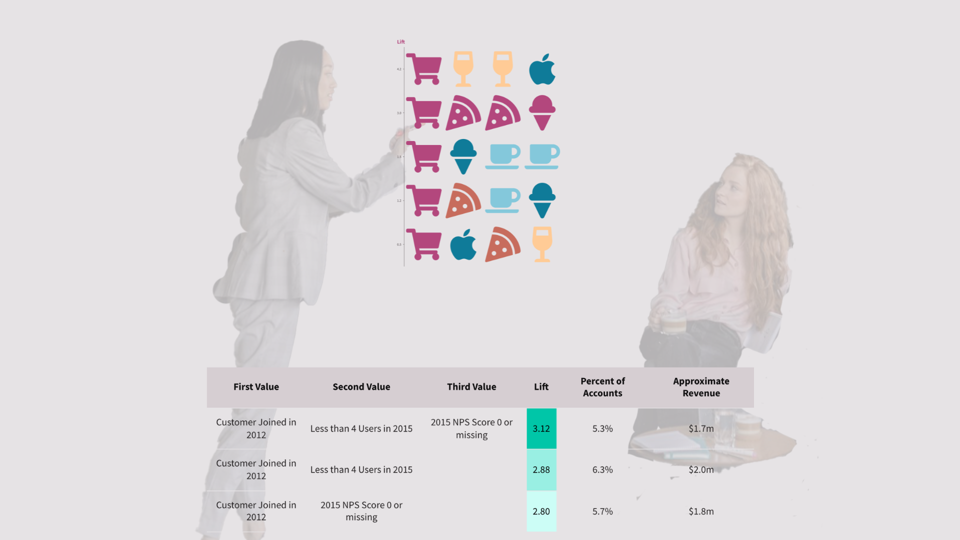
For my project, I ran my Market Basket Analysis with a support level of 5% and a confidence level of 50% and got three rules. Customers who churn had these things in common:
- Lift: 3.12x—Customers who subscribed in 2012, had less than 4 users, and an NPS score of 0 or missing.
- Lift: 2.88x—Customers who subscribed in 2012, and had less than 4 users.
- Lift: 2.80x—Customers who subscribed in 2012, and an NPS score of 0 or missing.
In plain English, old small accounts which had a missing NPS score or a score of 0, were 3.12x more likely to churn.
You can read more on how I executed the Market Basket Analysis here. Again, it’s a long one, so just read that excerpt.
What’s clear is old accounts are the likeliest to churn. Any actions we take to reduce churn should prioritise this.
To drive home the insight, I not only included the percentage of accounts that fulfilled these criteria, but also estimated their revenue.
However, having an insight isn’t enough. If you want stakeholders to absorb your insight and take action, you have to tell a good data story.
And the deliverable from this task was to create a presentation.
Next time will be the final post of this series. If you’ve read this far, then boy-oh-boy, are you in for a treat. (And also, thank you for reading this far).
I’ll share how I built the data story and why I structured it the way I did. I’ll also share the final result.
See you there.
This was first published on my LinkedIn.