I spent 14 hours creating a custom data visualisation (a recreation of a template that took 15 minutes to customise). Why? We’ll get to that later.
But for now, it means you can get a behind-the-scenes peek of how your favourite data visuals get built.
I might not have created your favourite ever data story. Whether it’s the BBC’s “Find out about hospital waiting times in your area this winter”, or the areas of deprivation data story (FT paywall, but first to publish, BBC, later, but accessible to all), or my still all-time personal favourite, (okay my second favourite) The Pudding’s Women’s Pockets are Inferior 1My all-time favourite is Vox’s “Every time Ford and Kavanaugh dodged a question, in one chart” which elegantly captures in one visual how many times Brett Kavanaugh dodged the question in his controversial Senate testimony. However, it’s disappeared on Vox’s website (which is now paywalled), and web archive links don’t capture the interactive visual. Alas, the ephemeral nature of the web. I thought things were supposed to live forever on the internet?
But I do know what goes into making them. And I’ve been reverse-engineering a chart of mine built with an off-the-shelf tool (Flourish) and replicating it in D3.JS
I grabbed “snapshots”2Git commits, really. as through this journey. You can view its progress from raw and ugly to its first presentable form…and it isn’t even finished (it’s static instead of interactive).
(These work-in-progress charts were optimised for the web, not mobile. So if you’re viewing this on your phone, some of the charts might look compressed. My later charts are responsive, but that’s for another post).
My first goal was to recreate a static, no animations or transitions, version of my original Flourish chart. This took about 14 days of early morning coding sessions. Most of this is because this is my first work-from-scratch project in D3.
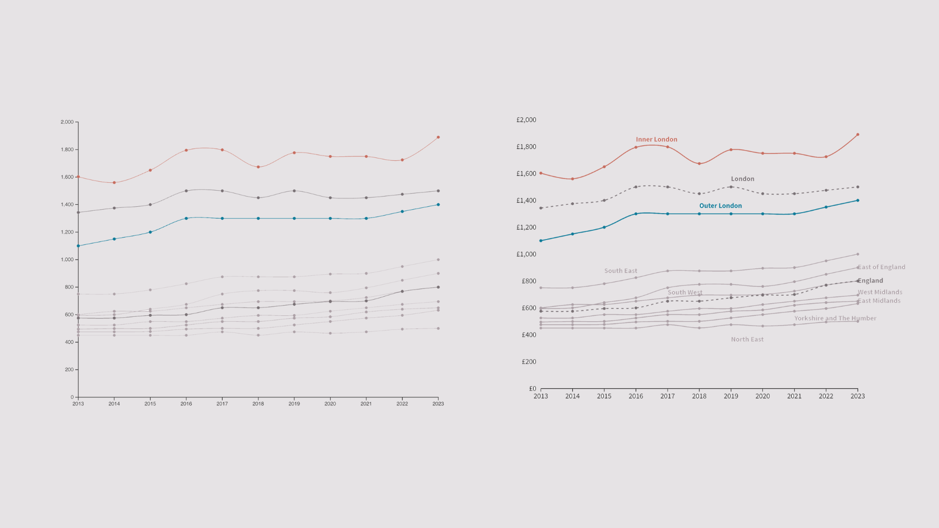
Here is the original flourish chart for reference.
Time taken: (Once I had the data) – Excluding the 500+ hours of experience I have working with Flourish, or the 2-5 hours I spent making my brand templates (excluding the brand research)… 15 minutes.
This is the first step, a lot happens behind the scenes. The HTML and JavaScript structure is built. The data is read and reformatted in JavaScript, and there is a lot of testing with the web console to ensure the data is outputting exactly the way one wants. Transforming flat CSVs into nested JSON hierarchies…is let’s just say a character-building exercise.
But hey a visual milestone: some axes!
Time taken: 2-4 hours.
We start to have something that looks somewhat like the original. Squiggly lines, and they have the same colours as the original.
Time taken: 2 hours
Labels. There was a wasted rabbit hole trying to space them out like the original – but the technicalities of using the d3-force module are beyond the scope of this project.
Execution requires trade-offs. Perfectionism is the art of loving the beginning….because you never have to do the messy trade offs required to get to done. But perfectionists don’t ship, “real artists ship”.3Steve Jobs FYI.
But we have labels, and they’re placed in more strategic places in the chart itself than the original. Something that couldn’t be done with flourish.
Time taken: 4 hours
Making London and England dashed required more wrangling (did I tell you working with JSONs is fun? I hope you can hear the sarcasm through the screen), than I expected – but I’m satisfied with the result.
It looks similar to the original, with a few tweaks in label placement, and adapting the font-style to my website’s brand. Tweaks that were impossible with Flourish.
Time taken: 2 hours
Total time taken to get here: 12-14 hours
So why bother spending 14 hours coding a custom data visualisation that I could build in 15 minutes with an off-the-shelf tool?
Forgetting the fact that you need to go slow to go fast, to get a fingertip feel, to be able to build your intuition – why is this of benefit if you want deliverables?
Because tools like Flourish, Tableau, or Power BI are rented land. What you gain in speed, you lose in control. If you want a chart that perfectly matches a brand’s font, snaps exactly the way you want on a mobile screen, or tells a story exactly how you envision it – that will move people the way you desire, not the way a template constrains you – you have to build it yourself.
And use those lessons in delivering what will do the job.
I’m doing a bigger write-up on what I learned from this project. About the relationship between art, struggle, and deliberate practice…all via data visualisation.
Sign up below to get first access when it’s out (you’ll also instantly get my three-part data-essay: London’s Affordability Crisis).
Understand Why Sometimes You Need to Go Slow to Go Fast.
This project taught me a lot about the relationship between struggle, mastery, and art. More relevant than ever in our age of AI slop. I’m doing a bigger data essay on it.
Sign up to get first access to it. You’ll also instantly get my three-part data essay on London’s Affordability Crisis.
Go one layer deeper
![]()
Sign up to read the exclusive three-part data story: London’s Affordability Crisis
Sign-up form not appearing above? Pesky JavaScript blocker… click here and scroll to the bottom for a vanilla boring Mailchimp form that works on all devices.