This is the end of a long series of posts. Here I show an example of how I put together the data story for my market basket analysis.
This is the final post in My First Predictive Analytics Project series. To recap:
- Part 1: An introduction to my first predictive analytics project, and why I’m writing it up.
- Part 2: The business problem, and why it was perfect for a Market Basket Analysis.
- Part 3: How a Market Basket Analysis works, and some of its unique challenges.
- Part 4: The challenges of encoding your data for a Market Basket Analysis.
- Part 5: The tools I used for my Market Basket Analysis.
- Part 6: The settings and controls of a Market Basket Analysis and my results.
In this final post, I’m going to discuss the data story I built to deliver my insights, the business impact of my insights, and the personal impact this Market Basket Analysis project had.
Stories are important. Right from the beginning of our existence we’ve used stories to convey why one shouldn’t eat the poisonous berries, or why it’s a really bad idea to steal Bill’s food, because he’s got a very big club, and he knows how to use it.
Stories aren’t just to entertain—they’re to deliver a message. They activate our empathy muscles, and make us absorb information that no-other technique can compete with1Humour is a close competitor, but humour is also a form of storytelling..
With data, it’s important to deliver your insights with a data story because it answers the following questions for the stakeholders:
- Why should I care?
- Why is this important?
- How credible is this?
- How much should I prioritise this?
- What do I do next?
Finally, a data story makes your insights memorable. They’ll be top of mind when the stakeholder encounters situations where your data is relevant.
For my insights to have maximum impact, I needed to build a story leading to the conclusion.
After the usual presentation introduction (What am I going to talk about, the business problem and how I’m approaching it), I created a section called “Context”. This would be where my data story would sit.
The Market Basket Analysis meant I knew which factors led to churn. I could now easily use this to go back and do some summary statistics to set the scene and build credibility.
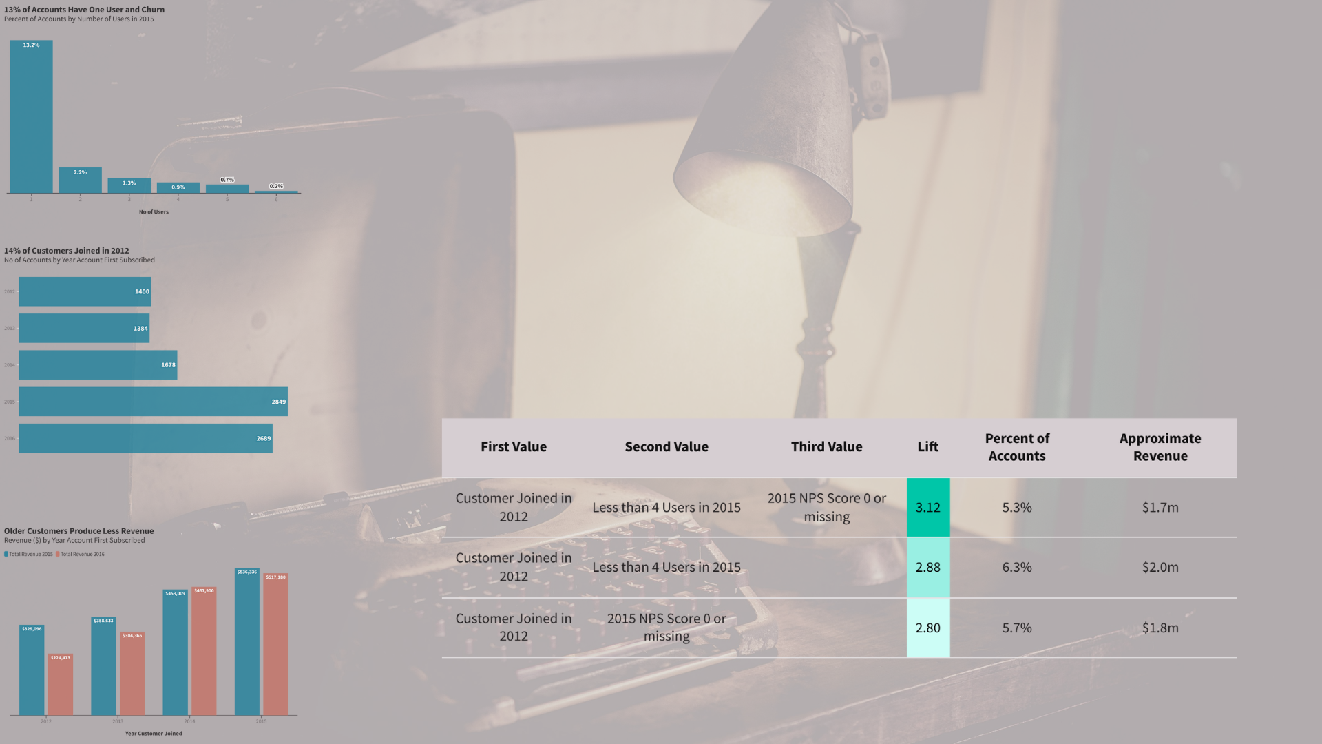
I put together some pivot tables the morning of the presentation looking at the age of accounts, NPS scores, and number of users. I turned these into charts, and looked at the revenue component of all of these.
An example of my market basket analysis data story
I showed that:
- These churned customers were worth $297,000, or 18% of revenue.
- I foreshadowed our conclusion – looking at churn by no of users.
- I showed that older accounts provide less revenue – another foreshadowing to our conclusion.
- Finally, I provided a scale of the issue – 14% accounts were in the oldest cohort.
- This all built towards the main conclusion: old accounts were most likely to churn.
You can find the data story and the presentation I created here. The post is a long one, so just read that excerpt.
I also kept revenue front and centre. After I shared my insights on who were churning, and provided some relevant recommendations, I shared how much they could save if only half of at risk accounts didn’t churn. The answer?
$850,000 to $1 million.
The stakeholder now had all the information they needed to ask further questions, or to decide their next steps.
That’s the business result. But what about the personal result I alluded to?
To cut a long story short—this presentation clinched the job interview. It was received well by the interview panel, and led to a job offer.
I chose to go with a different organisation, but it was a tough decision. However, I thoroughly enjoyed this project, learned a lot, and I hope in some way, somehow I can work with this organisation at some time in the future. Even if it’s a one-off freelance project.
And that’s a wrap on My First Predictive Analytics Project. That was a long one. Seven posts. But I didn’t want to deliver the usual “empty calories” that can be short form “how to” data content.
I wrote this up for a few reasons:
- To practice my technical writing skills (and showcase my new scrollytelling skills)
- To have a comprehensive data write-up on my portfolio. You never know what doors it can lead to…
- To inspire a data person like me that predictive analytics isn’t that hard.
Sure there are challenges, but its relatively straightforward. You can copy my definitely-not-perfect-but-does-the-job Python script if you dread writing the code from scratch yourself.2Or wrestling with a LLM to help you write it.
Predictive analytics can be helpful not only to answer certain questions, but to focus your analysis. It’s also just plain cool.
If you got this far in the series, and enjoyed reading these posts, you deserve a treat. Have that cookie you’ve always wanted, or just make a cup of tea.
After that, if you’re looking for more, why not read my visual write-up of this project? It’s my first showcase of my scrollytelling3If you don’t know what scrollytelling is, then you have to check out my write-up. Then google what it is. It’s not the killer weapon in a Data Journalist’s data storytelling arsenal, but it does come close. skills.
–> How I used a Market Basket Analysis to get a job offer <–
Till next time.